

fig5
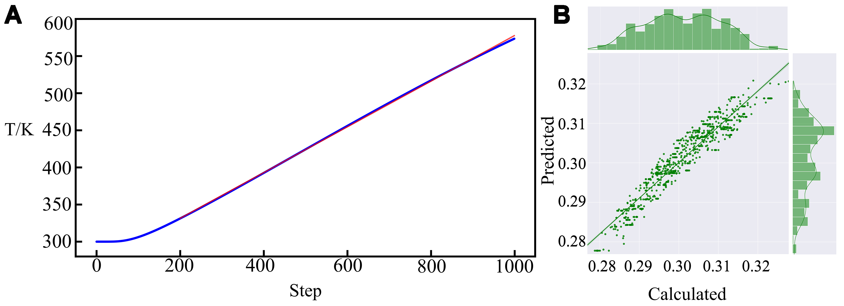
Figure 5. (A) Schematic diagram of the fitted slope at the end of temperature rise of the second layer; the red line represents the fitted straight line, the blue scatter line represents the original temperature curve; (B) Regression analysis graph for Kend_2 (the bar charts above and to the right represent the data distribution).